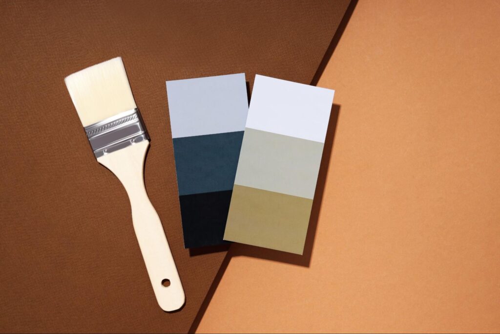
Some colors age like fine wine. They look as good on a home today as they did decades ago. While trends come and go, some house paint choices always feel right. They blend style, comfort, and curb appeal in a way that works. These classic ideas speak to more than just design—they reflect personality and purpose.
Why These Ten Timeless House Paint Ideas Work
Design trends may shift, but some colors never lose their power. These shades don’t just survive the years—they lead them. They continue to work because they suit real homes, people, and light. Each one serves a purpose beyond aesthetics and tells a story that lasts.
1. Classic Whites Always Work
White homes have always carried a quiet power. They speak of cleanliness, simplicity, and timeless charm. White always fits in a sleek modern home or a cozy cottage. Its flexibility is unmatched and suits almost any setting.
Pure White for a Crisp, Clean Look
Pure white paint gives a home a polished and clean look. It’s especially popular in colonial and minimalist architecture. The brightness adds a sense of space and freshness to the exterior. Pair it with black shutters or wood accents for contrast. Pure white never looks out of place, no matter the decade.
Soft White for Warm, Inviting Tones
Soft white shades like ivory or eggshell feel cozy and inviting. They add a subtle warmth that pure white doesn’t offer. These tones are perfect for homes in cooler climates with softer light. They also work well with brick, stone, or wood features. Soft white feels lived-in without looking dated.
2. Neutral Beige and Greige House Paint Ideas
Neutral tones are popular for a reason. They create a sense of calm and don’t clash with surrounding elements. Beige and greige remain two of the most reliable paint ideas. They’re subtle but still bring character to a home’s exterior.
Beige With Yellow or Brown Undertones
Traditional beige brings warmth without overpowering other elements. Yellow undertones offer a sunny, comforting effect. Brown tones ground the color and work well in wooded areas. Beige also complements landscaping and natural surroundings. It’s a dependable choice that looks good year-round.
Greige: The Blend That Covers All Bases
Greige is a brilliant mix of gray and beige. It’s a go-to for those who want something neutral but not boring. It works with both warm and cool trim colors, which adds flexibility. Greige also holds up well against weathering and fading. It’s perfect for people who want a low-maintenance style.
3. Navy Blue Adds Sophistication
Navy blue has a strong, classic presence. It feels high-end without trying too hard. Whether used across the full exterior or for accents, it adds depth. The navy suits both coastal and urban settings well.
Matte Navy for Exterior Statement Walls
Matte navy creates a bold yet refined finish. It absorbs light and creates a smooth, elegant surface. Homes painted in matte navy feel anchored and modern. It pairs well with brass fixtures, natural wood, and crisp white trim. This style especially shines on contemporary and craftsman homes.
Glossy Navy for Accent Trim or Doors
Using glossy navy on doors or trim creates a striking contrast. It gives entryways and frames a polished, rich tone. The shine catches light, adding texture to the home’s design. It looks especially sharp against white or beige walls. Glossy navy creates that perfect pop without overwhelming the space.
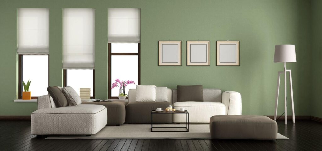
4. Earthy Green for Natural Appeal
Green tones bring the outside in. They blend well with trees, gardens, and stonework. These shades feel peaceful and grounded, especially in suburban and rural areas. Earthy greens are timeless because they reflect nature.
Olive Green Blends With Landscaping
Olive green feels mature and balanced. It works beautifully with darker roofs and stone elements. The shade blends effortlessly into forested or landscaped areas. It doesn’t draw attention but holds its own. Olive is perfect for craftsman and ranch-style homes.
Sage Green for Calm Energy and Serenity
Sage is soft, muted, and easy on the eyes. It brings a calm energy to the home’s exterior. Sage works well with off-white or taupe accents. It also holds up beautifully in changing light throughout the day. This tone creates a welcoming and settled appearance.
5. Charcoal and Gray House Paint Adds Depth
Gray isn’t dull when done right. Charcoal and lighter grays add dimension and mood. These shades work well on both historic and modern homes. Their quiet confidence gives homes a grounded, stylish edge.
Deep Charcoal for Modern Urban Homes
Charcoal gray has a sleek and modern vibe. It’s a favorite in urban neighborhoods and industrial styles. This tone works well with metal, glass, and black trim. It creates drama without looking loud. Deep charcoal gives minimalist designs a bold personality.
Soft Gray for a Versatile, Balanced Base
Soft gray suits almost any style or location. It sits between warm and cool tones, so it adapts easily. It also complements wood, stone, and brick elements. Soft gray is ideal if you want flexibility without sacrificing charm. It’s a solid base that works with many accent colors.
6. Timeless Black and White House Paint Ideas
Black and white isn’t just a trend—it’s a lifestyle. This color duo never goes out of style. It brings contrast, structure, and elegance to a home’s look. No other pair offers the same crisp appeal.
Black Trim Against White Walls for Bold Contrast
This combo makes architectural lines pop. It brings out details that might otherwise fade into the background. Black trim looks especially sharp on colonial and modern farmhouses. The look is clean, confident, and never out of place. It’s one of the easiest ways to boost curb appeal instantly.
White Brick With Black Shutters or Accents
Painted white brick has an old-world charm. Adding black shutters or doors gives it a modern twist. This combination suits historic homes and new builds alike. The brick adds texture, while black details bring order. Together, they create a polished and timeless exterior.
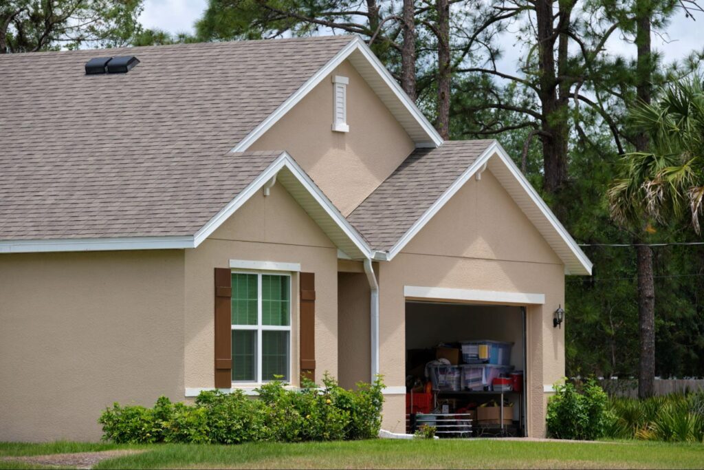
7. Warm Taupe House Paint for All Seasons
Taupe offers balance and quiet sophistication. It’s one of those rare shades that works year-round. Warm taupe feels cozy in winter and fresh in summer. It easily fits traditional, craftsman, and transitional homes.
Taupe With Pink or Mauve Undertones
These undertones give taupe a gentle, romantic feel. They add personality without overwhelming the base color. This version of taupe works well with cream or soft green trim. It feels relaxed but still refined. Perfect for homeowners who want subtle warmth and elegance.
Taupe With Sandy or Stone Tints
This version feels more grounded and earthy. It echoes the look of natural stone and desert tones. Sandy taupe pairs well with darker brown or black accents. It brings quiet depth to stucco and shingle homes. It is a wise choice for those who want a dependable classic.
8. Subtle Blue House Paint Adds a Classic Touch
Blue is always in style, especially in softer shades. Light and mid-tone blues bring peace and comfort. They reflect the sky and water, adding a calming energy. Subtle blues are excellent for family homes and coastal locations.
Sky Blue for a Breezy, Coastal Vibe
Sky blue feels open, cheerful, and breezy. It adds a soft brightness to any exterior. White trim sharpens the look without stealing attention. Sky blue suits Cape Cods, beach cottages, and smaller bungalows. It brings charm without trying too hard.
Slate Blue Anchors and Calms
Slate blue is a deeper, more muted shade. It holds weight but still feels approachable. This color blends well with stone, wood, and gray roofs. It’s excellent for craftsman or colonial homes. Slate blue feels both classic and contemporary.
9. Terracotta and Clay-Inspired House Paint Ideas
Terracotta has a rustic, handmade beauty. It connects a home to nature and tradition. Clay tones offer warmth, texture, and a bit of old-world charm. These colors work well in warm climates or homes with Spanish or Mediterranean influences.
Burnt Orange or Terracotta for Rustic Charm
Burnt orange tones bring vibrance without looking loud. They add life to stucco walls and clay tiles. Terracotta works well with natural landscaping and wood accents. It creates a rich, sun-warmed appearance. This shade feels earthy, bold, and full of personality.
Clay Beige for a Soft, Mediterranean Feel
Clay beige leans soft and dusty, not too bright. It pairs beautifully with darker trim and ironwork. The color blends in with dry climates and stone-heavy designs. Clay beige is ideal for patios, courtyards, and breezy open spaces. It holds warmth without being overpowering.
10. Soft Yellow and Cream House Paint Ideas
Yellow gives homes a friendly, sun-kissed look. When softened into butter or cream tones, it becomes timeless. These hues feel hopeful, bright, and comforting. They make homes stand out while still feeling classic.
Butter Yellow for a Cheerful Exterior
Butter yellow is soft and sweet without looking childish. It lights up a home, even in cloudy weather. White trim or gray shutters balance out the color. This shade is perfect for small cottages or homes in green areas. It brings energy and joy to
the exterior.
Creamy Neutrals for Light, Airy Appeal
Cream tones feel fresh and classic at the same time. They offer the brightness of white but with added softness. Cream works with red brick, dark roofs, or wood beams. It’s an excellent choice for homes that get a lot of sun. The result is warm, welcoming, and clean.
Make Your Move With Timeless House Paint Ideas
Your home speaks before you say a word. The colors you choose shape how it’s heard—bold, calm, warm, or wise. Go with what lasts, not what’s loud. Paint doesn’t just cover walls; it sets the mood for years of memories. Pick timeless, not because it’s safe but honest—and that always holds up.
Ready for more color confidence? Visit the Euro Painting blog for expert tips and timeless inspiration.